
Unit overview

Summative Reflection |
Kathe Kollwitz |
|
WWW- I liked how all my prints turned out. They all had similarities and differences. On my 3rd print the effect of the black ink was feint and made it look more like a road under the stars.
EBI- I think that my transition from dark blue to black was a bit weird because of how solid they both were so there was no affect. I think it would be better if (other than the 3rd print) the black on all the other prints were feint so they would all look better. On my 2nd print the color of the sky wasn't really solid and It would of been better if I added more ink to that while printing. |
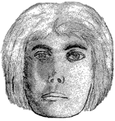
A brief introduction on Kathe Kollwitz
Kathe Kollwitz was born in the 19th century and survived through the first world war and most of the second world war.- Her son died in the first world war because he was a soldier that went to fight. Kathe Kollwitz was a very creative wo-man and because of her lifestyle her work is based on how mother and children suffer from wars. 
|
Compare and Contrast
Of course I cannot sympathize with Kathe Kollwitz. She has had a bad life and had been through both world wars. Both our prints were related to real life things and self portraits however my print was focused on the beautiful side of life and hers was focused on the scary and dark side. In terms of what we see, Kollwitz's prints focus on her face whilst my print focus on the things I like.
There's no such thing as talent?
I don't believe there is such thing as talent. Practice makes perfect and with enough motivation and time I believe you can achieve your goal. I do agree on some people can be naturally built to do something for example; If you have longer fingers it would be able to play guitar easier, or if you have long arms it will be easier to swim. A clear example of no such thing as talent is a timeline of a person drawing:

|
Drawing development 2-16 yearsThe first picture is drawn by a 2 year old, and the second one by a 16 year old. As a child you start to scribble because you haven't developed much of a skill for drawing. As you get older you start to draw more formed drawings. Like scribbles of something that sort of looks like a person or an animal. Getting older again things start to get clearer and you start to make your drawing more realistic by the age of 12 and older your drawings will start to look more adult-like and by 16 you decide to improve your drawing skills or not. Like I said if you have enough motivation and time you will be able to achieve your goal. We all have gone through this drawing process and I got to my hand drawing. Which I don't count as talent because this development has got me to this stage.
|
Sources:

|
Pre-Instruction drawings We were told to answer a few questions about us related to art and then asked to draw a picture of a hand an a realistic picture of a person.
Hand Drawing What worked well: I had a good idea of what I was gonna drawing and I have drawn a simple picture of a hand before so I had some extent of experience. Even better If: I didn't really add tone or anything and I personally like the cross-heir technique it really helped with my drawings. The knuckle on my hand was not very realistic and my fingers were very well related too sausages. Face Drawing What Worked well: In this drawing I actually used tone especially on the nose and the cheeks. Even better if: Other than drawing features well with tone I think that I positioned them wrong because the head looks way bigger than it should be and the chin looks pointy. I also don't know how to draw proper lips and I still need to improve on my eyes. I also didn't have time to draw hair and add more tone. |

|
Picture Plain - Cross Heir Technique
|

|

|
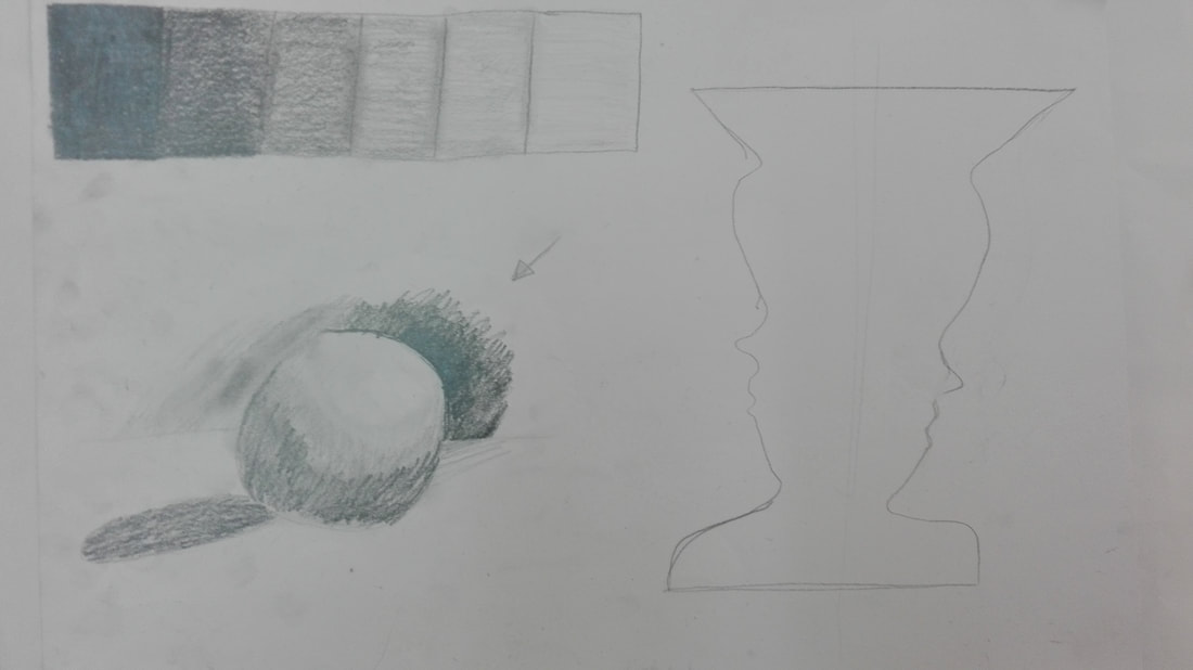

White on black - Playing with tonesIn top left corner we had to go from white to black and because paint is not like pencil you can't press down to get darker. So we used dots and the spaces between them are how light or dark it is.
Then we went on to drawing our ball on the table. Painting where we wanted it to be light and leaving where we wanted it to be dark. It prepared us for our lino cut because we have to cut out all the places we wanted to be white and leave the rest. It isn't exactly lino cut but it is planning out the light and dark areas which is one step towards making a lino cut. |
Playing with tones1- Box tones
We started off we a dark and thick pencil (3B) and shaded the first one or two boxes. Then when we couldn't go any lighter with that pencil we used lighter pencils like HB and the lightest, F. 2- Ball on table practice drawing We practiced drawing a ball on the tale, focusing on light, shadow and tone. 3- Candlestick We were told to draw a side profile of a face and then copy it symmetrically onto the opposite side and it then looked like a candlestick. Ball on table drawingFirst we had to sharpen off some graphite onto our paper and then mix it in well with a tissue. Once we had that background we used an eraser to mark all the white, light bits in the drawing and used a pencil to shade black, dark things in the drawing.

|

|
Formative hand drawing using Cross-heirSince we had already practiced for the "Egg on paper" summative we also had to practice for the hand drawing summative. Using the cross-heir technique, we sketched our hands straight away and attempted to re-draw it adding tonal effects. I personally think that this is much better than my pre-instruction drawing and I have improved. The hand was a considerately good size because of how big the paper was. The only thing I think I need to improve on this is still making the fingers look less sausage-like and find out the light and dark areas on my hand because I did add tone here, but I don't think I added enough tone.
WWW I think I added substantial detail and my fingers were drawn to an appropriate length and they weren't as "sausagey" as my pre-instruction drawing EBI I could've made the drawing bigger and added more realistic tone. |
Summative Hand drawingAfter practice with our formative hand drawing we were told to pick any object and put it in our hands in a specific style and draw it bigger onto an A3 paper. I used my earphones and wrapped them around my hand. We had a choice whether to draw the cross-heir directly on our hands but I took a picture and mr.keys printed it which was easier for me because I had more hands to work and more accuracy of my cross-heir which helped me get to the picture on the right.
I first worked on my darker tones before adding detail and lighter tone. WWW I really like the shape of my hand and the tones that I added I am really proud of this drawing overall. EBI I think I could of improved the shape of the thumb a bit and also make the actual ear piece part of the earphones a bit bigger and more detailed because they don't look that well drawn in the picture |

|

|
Ball on table-Lino cutThis is the practice of a lino cut. The way we made this was with sharp tools and a small block of lino we cut out all the places where we wanted it to be light/white. Then we added ink by rolling it onto the lino and put it through the press and it came out well on the paper.
I also tried to write my name in the corner but it was too thin so it didn't come out well. |

|
SELF mind mapBefore we got to planning our lino cut we made a mind map to help us with our choices for our lino cut to display more about ourselves and help us choose what to make for our lino cut.
|

|
Final cut PlanI'm doing a multicolored cut of a road under stars. To do this I have to cut out everything I want white and paint it light blue and print. Then I have to cut out everything I want light blue then paint it dark blue and print. Lastly I have to cut out everything I want dark blue and paint it black and then print.
|
Statement of Intent
In my print I want people to see the light of the moon stars, in the night, shining on the road below as cars pass by and that people can see the reflection of the light on the trees and lastly a clear split in the sky showing the light and dark in the image.
Cutting stages Just like I said in the plan, I had to first start cutting out what I wanted to be white which was the stars, moon, road and trees (and I printed light blue). Then I cut out what I needed to stay light blue which was just the reflection/light around the stars and I printed dark blue. Finally I just cut off the entire sky because I wanted to keep it blue so I had half my lino cut and I printed it black. The final product of my print can be seen below
|

|
FINAL PRINTS
|
1/4

|
2/4

|
3/4

|
4/4

|
My work was put in an Art Exhibition.


|


|
